Jago – the new brand.
Published by Sites
Blog
In an incredibly busy 2017, Lead Agency underwent a dramatic transformation. We felt that we had outgrown Lead Agency as a brand and felt that it no longer represented us as a business or as people. So we have changed our name to Jago and rebranded. We couldn’t be happier about it.
Jago was born through the concept of energising businesses. ‘The Jago’ is actually an energetic Indian dance and means to ‘wake up’. We felt this was the perfect name to start a new chapter.
With a new name comes a new brand. Branding is one of the most important things to get right for any company. Branding is not just a logo or a business card; branding is like the initial handshake when meeting a new person. Nobody wants a limp handshake.
When approaching this rebrand, we wanted to celebrate simplicity; a ‘less is more’ approach. We wanted something that felt already familiar. To be in line with the culture of our company, the brand needed to have the ability to be playful and serious.
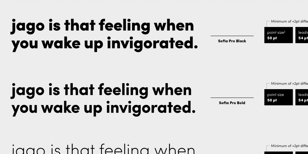
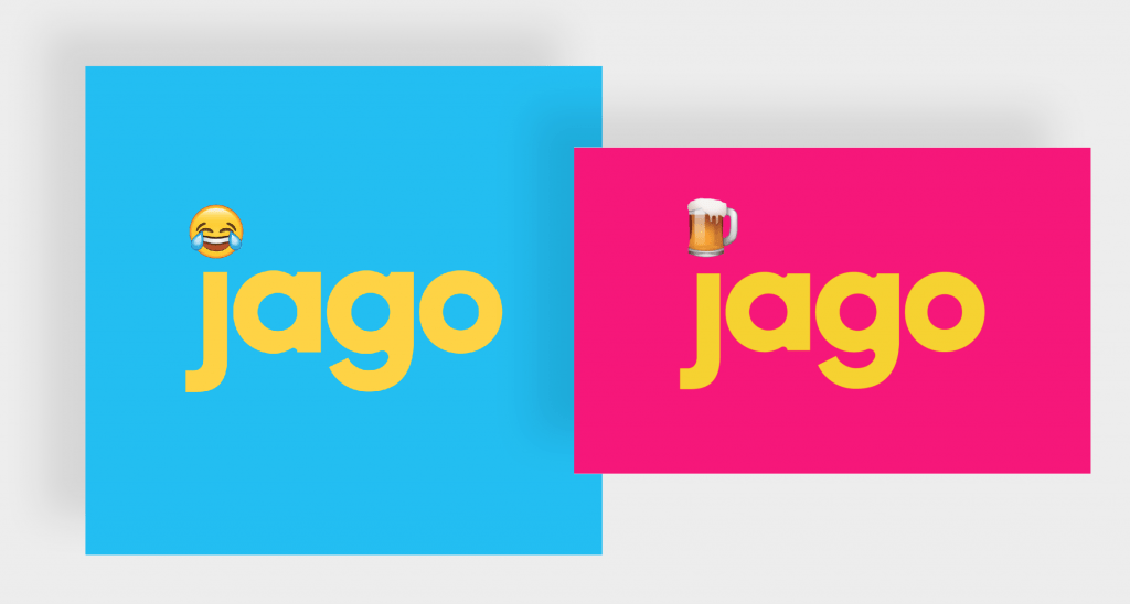
Our logo is simple and geometric as is the typography throughout our branded materials. The brand comes alive with the use of colour which is also inspired by simplicity with the decision to use a CMYK (cyan, magenta, yellow and black) colour palette. C, M and Y is used to enable us to have fun with the brand and K allows us to be serious.
This brand will continue to grow with new illustrations, animations and applications. We are super proud of our new brand and to show this, we will soon be publishing our brand guidelines online. Until then, enjoy some of the stills in the right hand column and below.