
What did we deliver?
Pathfinder
Marketing consultancy
Naming
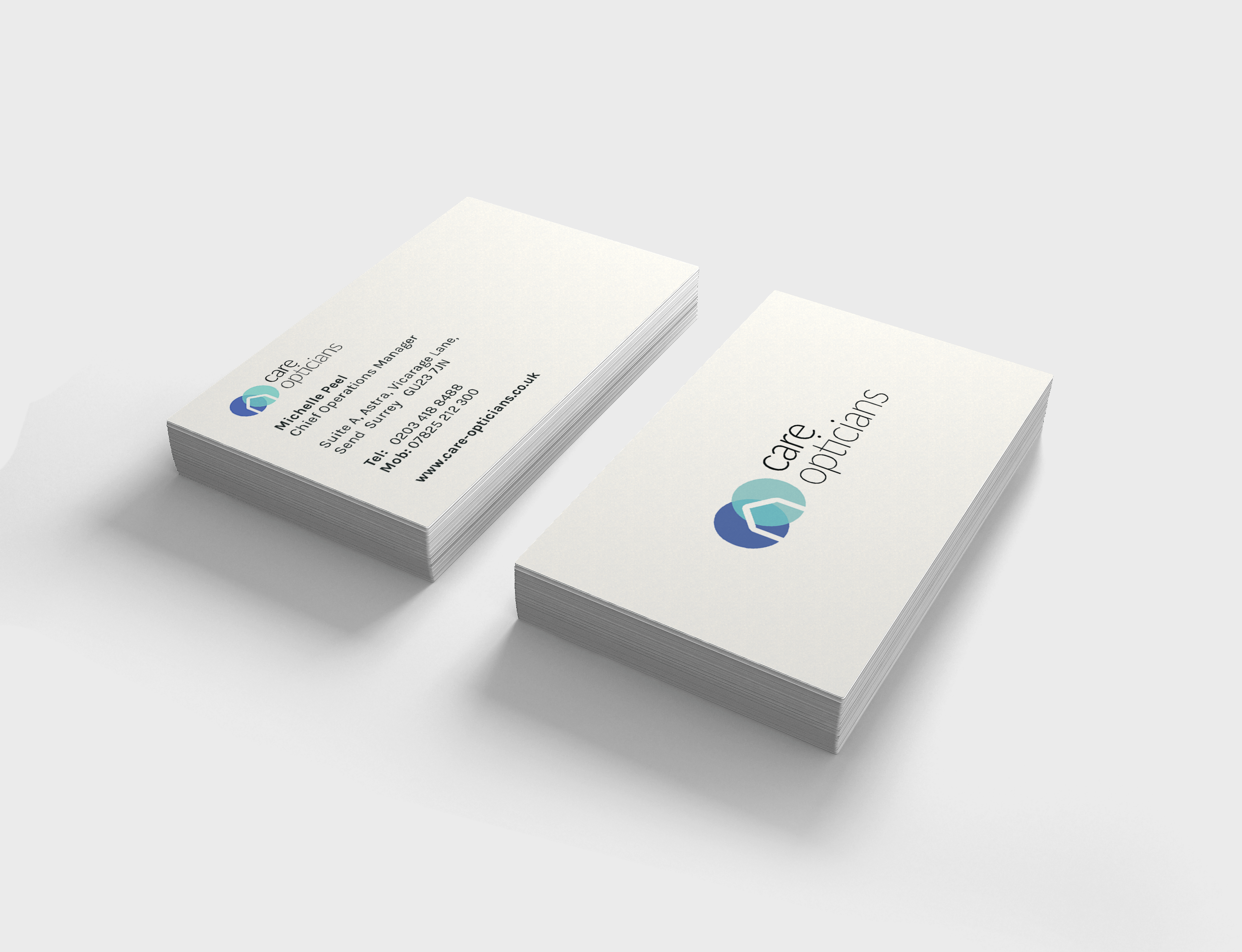
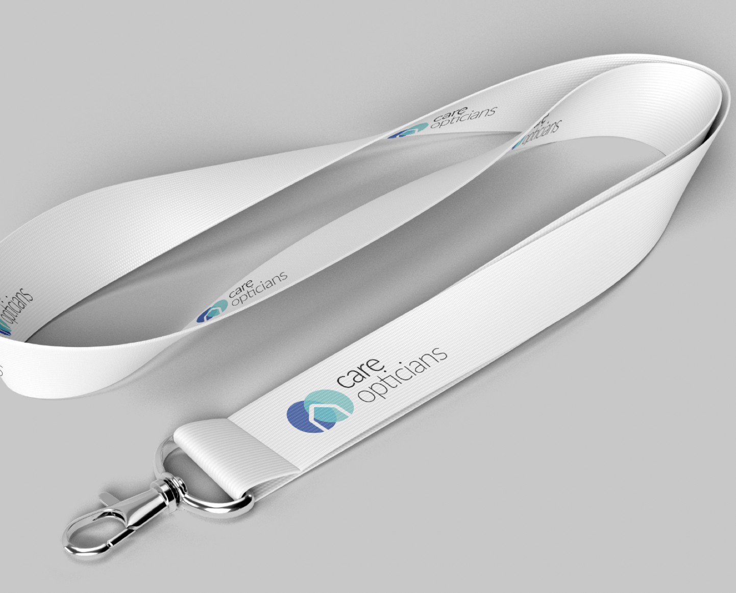
Visual identity
Asset creation
Stay Connected
Lovely stuff! You've Subscribed!
Pathfinder
Marketing consultancy
Naming
Visual identity
Asset creation