Originally operating as Real Life Digital, this business found themselves in a brand that was too broad and general.
They had a few wins with a specific type of client and felt the current brand didn’t support alignment with them.
With a new target client in mind they were no longer confident in their brand, specifically from a name and visual identity perspective.
Refine and transform.
The initial task was to refine what they already had. After exploring this, there weren’t sufficient options to achieve the impact so we proposed a full transformation.
Once they adjusted to the radical suggestion, we facilitated and consulted with them to create options for a new name and visual representation.
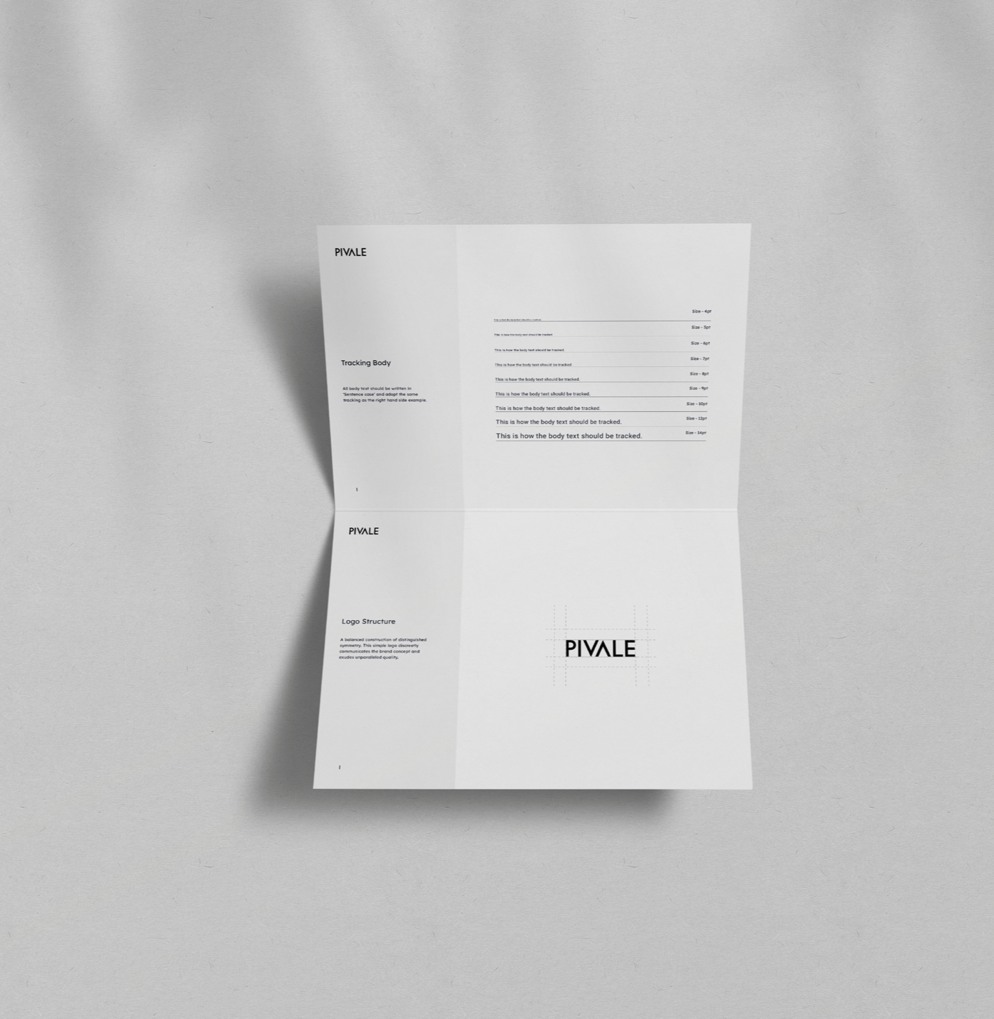
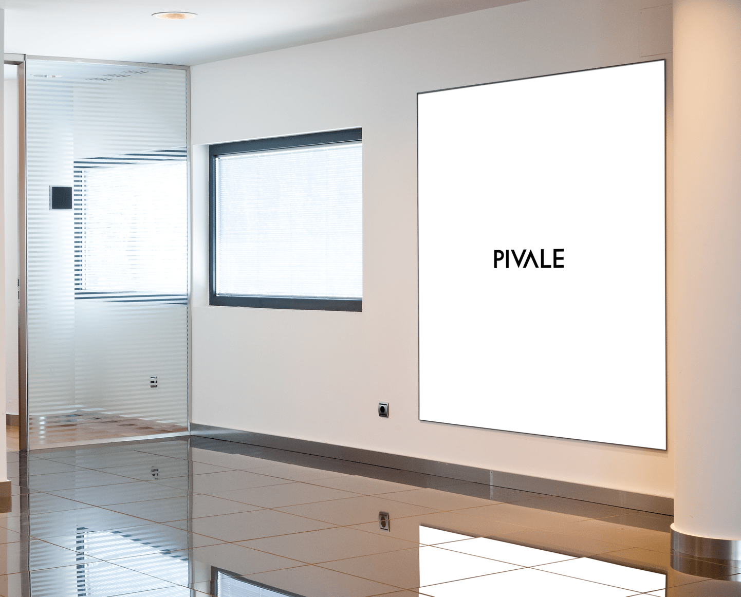
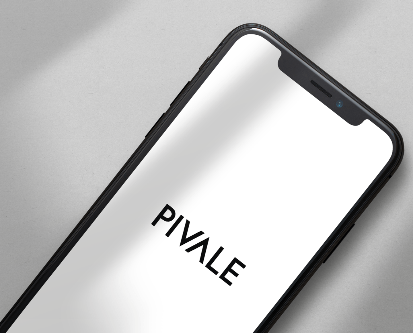
The result was two concepts that the owners loved equally. They canvassed clients and key contacts and chose one. The winning brand was Pivale – pivot and scale to prevail.
The concept utilised two “greater than” symbols in a centrally balanced, symmetrical design.
The brand has a high value positioning and has scope to pivot and scale to sub brand offerings and productisation of services.